项目详情
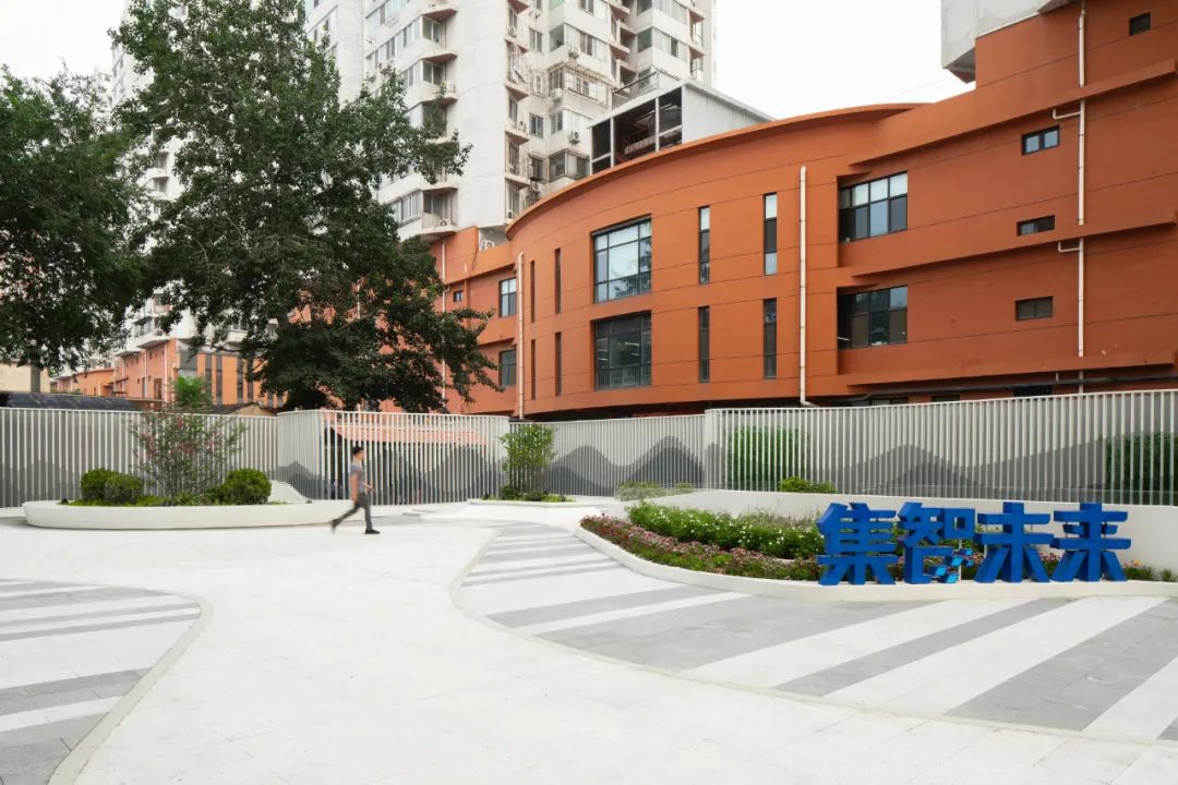
容纳多重丰富互动关系的‘城市客厅’ ©刘敏玲
改造任务 | Brief
改造前的场地条件较为凌乱,大量铺洒在场地上的无组织建构元素如设备箱,出风口以及燃气机房等,加上一条横贯整个院落的地库坡道(需要保留),严重影响院落朝向道路的整体面貌。项目要求在满足基本功能需求的基础上,提升院落视觉效果、增加停车位并改善人车流线的管理,从而保证后勤区域的高效使用。
A ramp leading to the underground parking, ventilation boxes and miscellaneous elements scattered on site had given the impression that the site is disorderly. Thus the design has to find ways to articulate these existing element, so what was scattered would be reformed and regroup into a system with hierachy, in order to transform this existing, redundant courtyard into a glamorous entrance plaza with intimate garden space.
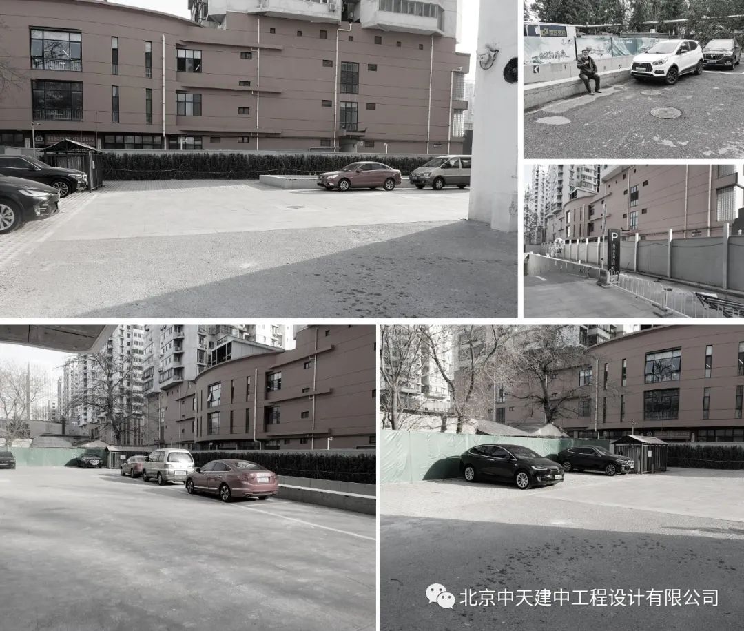
改造前场地原貌 | 摄影:甘力

总平面图©中天建中
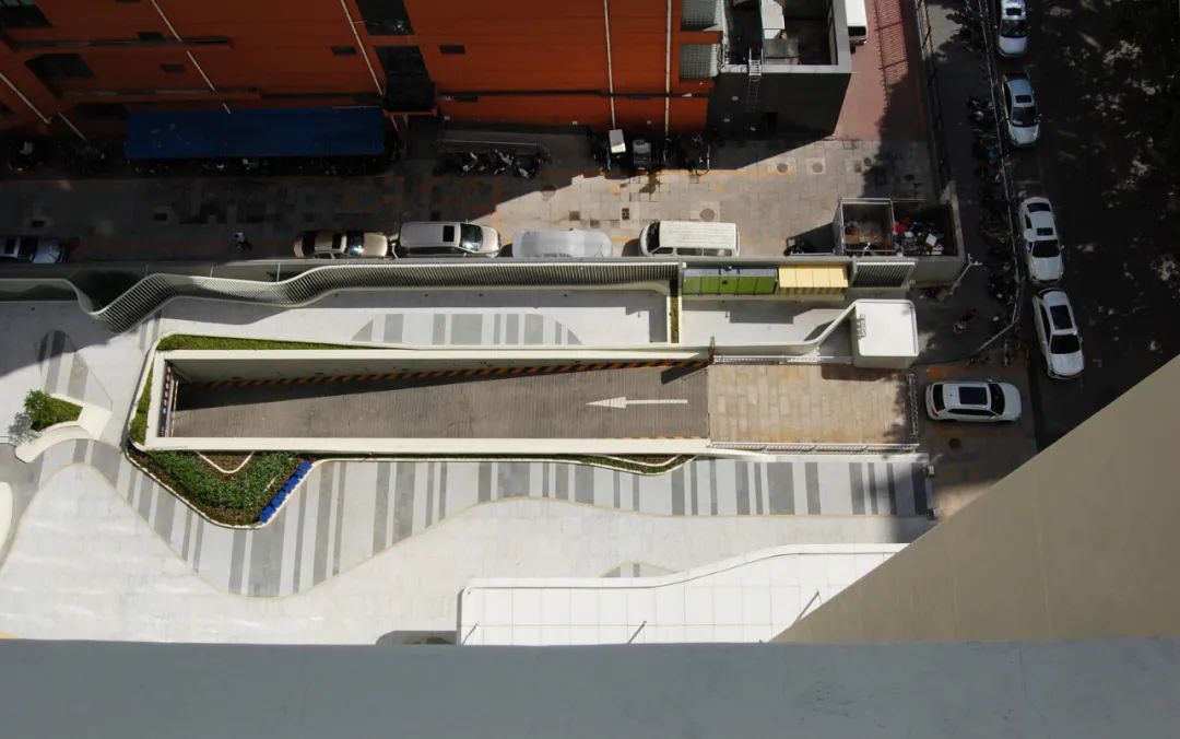
从办公楼内部俯视院落©甘力
属性定位 | Identification
考虑到北京干燥多风、降雨少、时有沙尘暴的气候特点,以绿植为主的方案会大幅度增加后期维护的难度,因此,整体策略更倾向于以硬地景观为主的设计策略。
Considering the extreme dry and windy climate of Beijing, to maintain a large amount of vegetation in the plaza would be costly and in-efficient, thus the design concept would put emphasis on creating a hardscape tech-plaza instead of a greenery park.
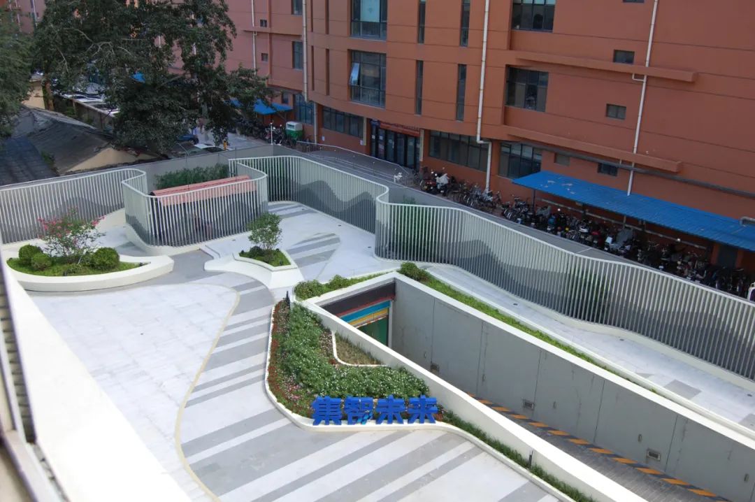
以硬地景观为主的院落空间©甘力
基于小院于周边环境的关系,它的空间属性不应该是开放的“市政公园”,而更应该是成为一种“户外围合空间(outdoor room)” —— 即小院的空间应该是立体的,而不是一个扁平的场域;一个能够容纳多重丰富互动关系的‘城市客厅’。
Based on the relationship with the surrounding context, the guideline approach of the design has taken the idea of an ‘outdoor room’, so instead of being a pure landscape ‘surface’ or a city park, this courtyard acts much more like an urban ‘foyer’ that houses a variety of dynamic event.
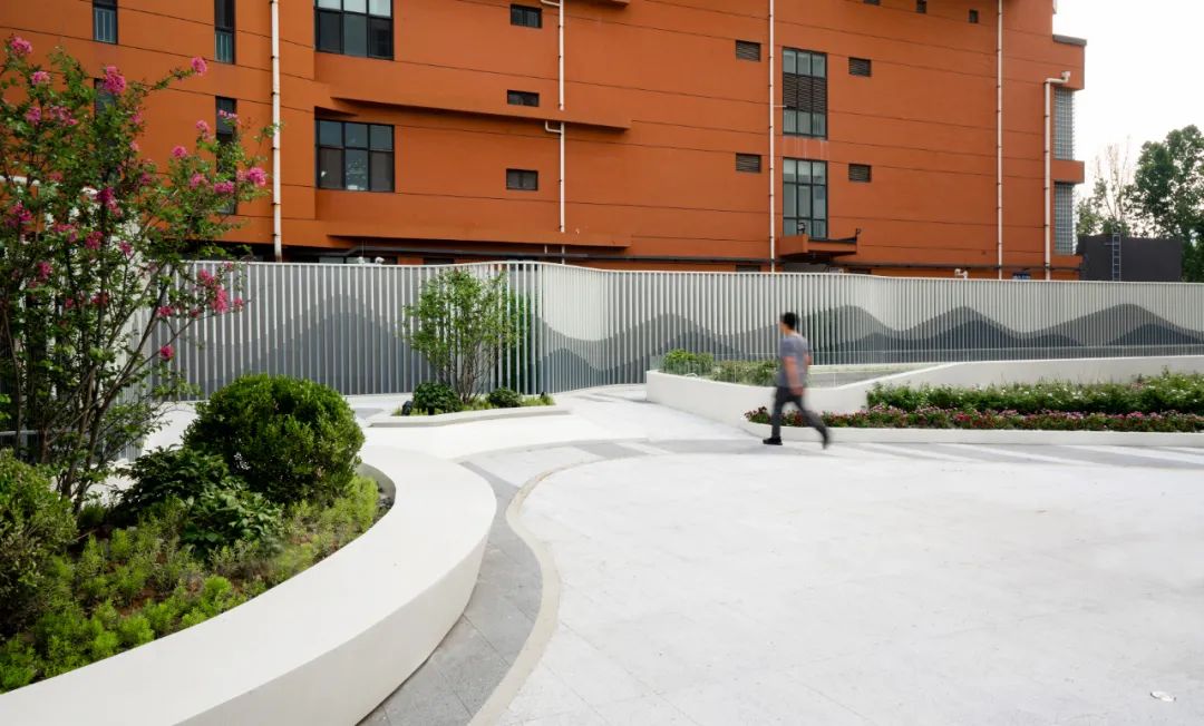
具有科技感的“户外围合空间”©刘敏玲
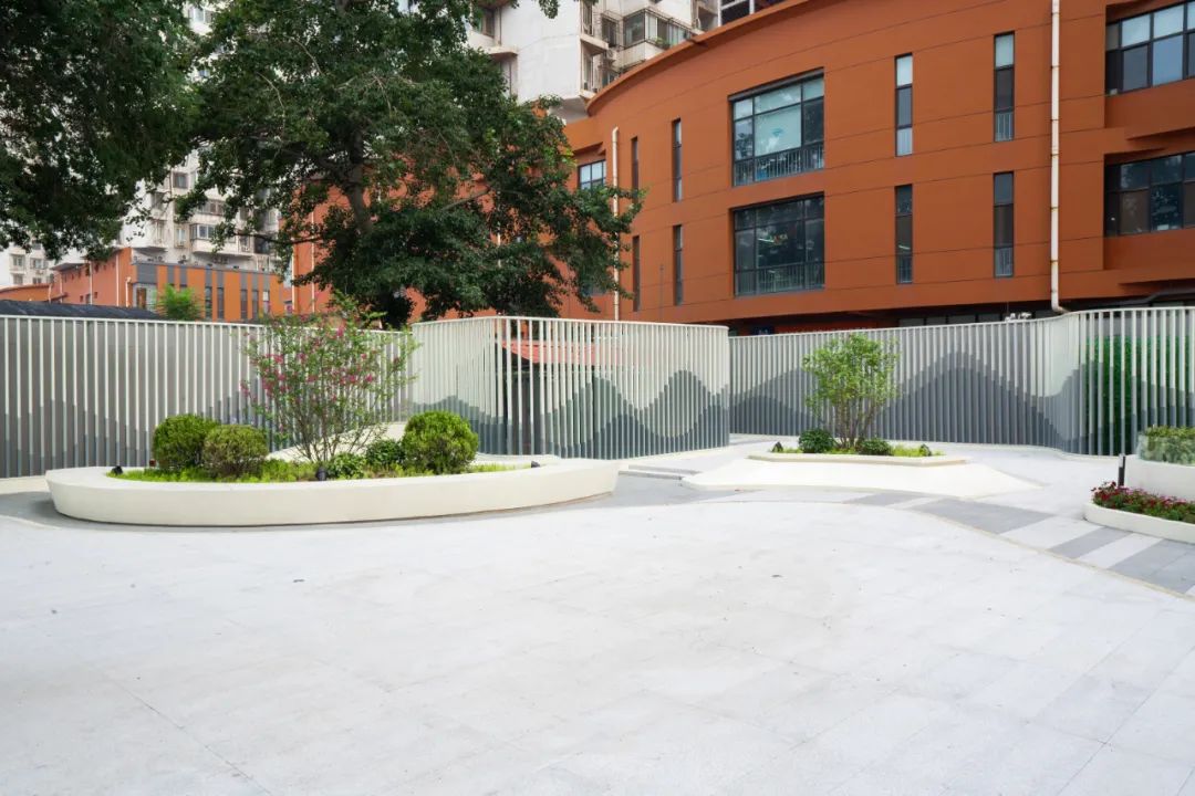
GRC花池与铝方通围栏的前后关系©刘敏玲
作为一个办公大楼的前院,它的功能并不是一个完全开放的公共空间,而具有一定程度的私密性需求。因此布局并不需要过多的停留式的休闲空间,而应更加注重观赏性,以及短暂的,快速通过空间时的浏览体验。因此在推敲的过程中我们为项目设定了三个主要的观察视角 —— 远观、入局和近看。
Being a office front-yard, the property of this space cannot be defined as a public open park, but more like a semi-private courtyard. Thus it doesn’t require much space for leisure and habitation and instead, the design should focus on the temporal experience when visitor journey through. Thus the design will focus mainly on three perspectives - from distance, approaching and close up.
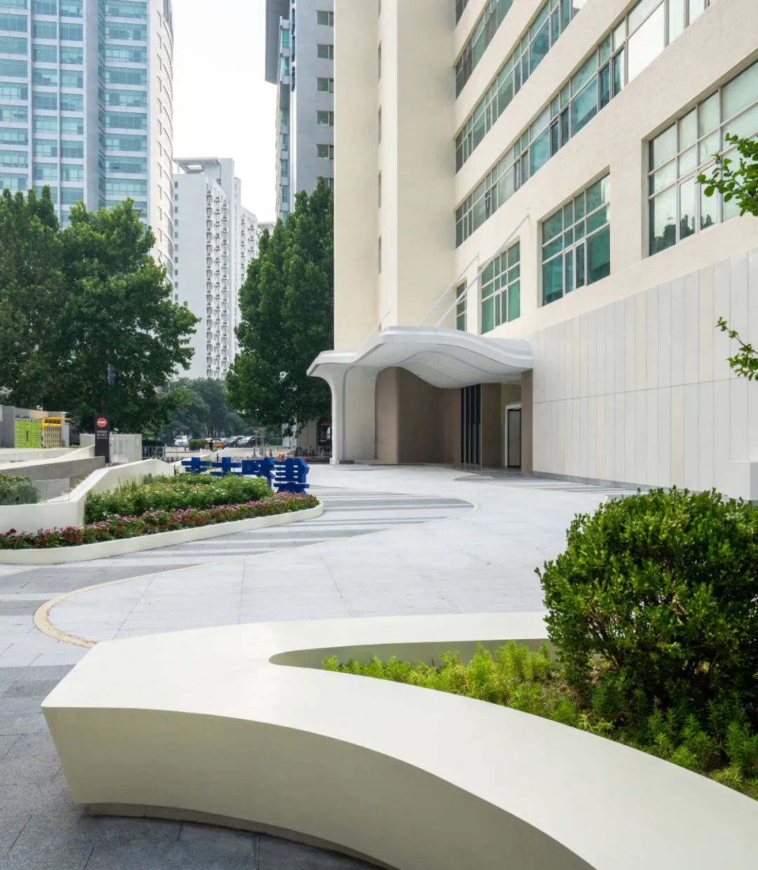
前院与办公楼以及城市的空间关系©刘敏玲
远观 — 背景画 | From Distance - Visual Backdrop
设计用抽象化的建筑语言将原有的生硬围挡转化为一卷生动的“山水画卷”。原来固定的边界演化成一个双层的墙体系统,一个是原有的场地边界直向的固体墙面,另外一个则是更为动感的,由铝百叶形成的浮动界面。从大厅入口的角度,看,围墙如同一幅水墨背景画,与其背后的居民楼形成鲜明对比。
A strategy of “thicken facade” is utilized so the original surrounding border that encloses the site would be transformed into a double-layered wall system, consist of ‘backdrop’ and the ‘front layer’. The ‘backdrop’ follows the existing rectilinear outline and forms a solid background, the ‘front layer’ on the other hand will be transformed into a vibrating “painting scroll”. From the lobby, this ‘backdrop’ will create a significant visual contrast with the existing context behind it.
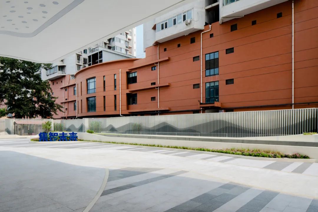
山水画卷与周边居民楼形成新旧对比©刘敏玲
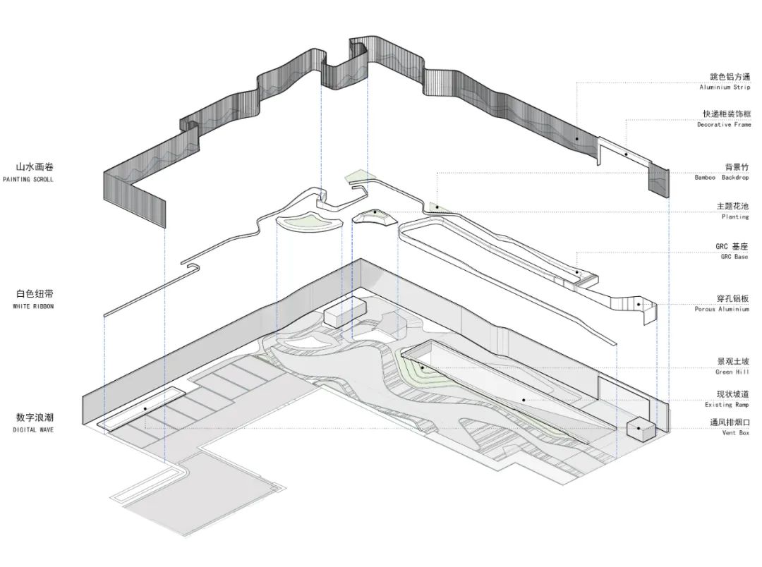
院落轴测图©中天建中
入局 — 融入画中 | Approaching - Submerging into Virtual Reality
设计意图实现的最终效果是一种能够让人感受到真实与虚幻并存的“类真实空间”。当人在花园中行走时,随着空间的动态形体和平面布局的流动性,会让人产生一种视觉上的非真实感,仿佛行人在行走的过程中会逐渐‘融入画中’。
What the design intended to achieve is a type of surreal space which will allow the visitor to gain the sense that he/she is submerging into a layer of virtual reality. In other word, when engaging with the space, the dynamic form and fluidity of layout will give the essence that this place is both real but virtual in the same time.
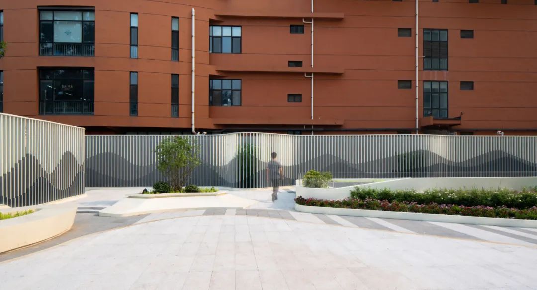
游人如同走入画中©刘敏玲
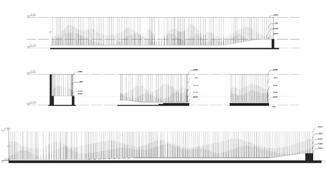
铝方通围栏立面图©中天建中
近看 — 舞动的边界 | Close up - Resonating Boundary
为了进一步丰富设计语言,围墙不仅在立面上进行“浮动”,而且在平面上也会根据小院不同区域的人员活动密集度进行“摆动”。比如在偏功能性的区域更为平整,而相对更具活力的区域,围挡在平面的波动则变得更剧烈。让人近距离体验时,感觉仿佛整个空间开始舞动。
The movement and configuration of the painting scroll will reflect the intensity of activities across the site. For example, in less intensive areas where less activities take place, the outline of the facade would be comparatively flat; whereas in places where pedestrian event and interaction is more frequent, then the level of ‘vibration’ would be more intense. So up close, it will feel like as if the boundary of the courtyard is resonating with our movement.
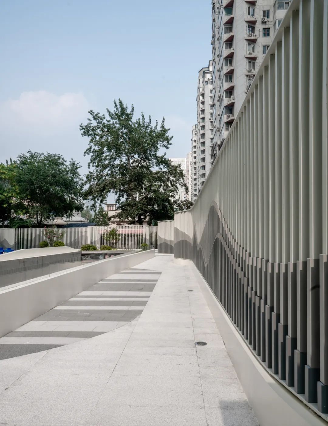
舞动的山水画卷©刘敏玲
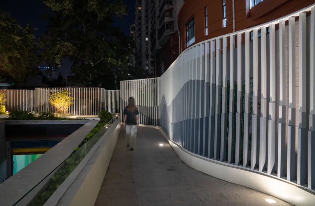
随着移动不断演变的界面©刘敏玲
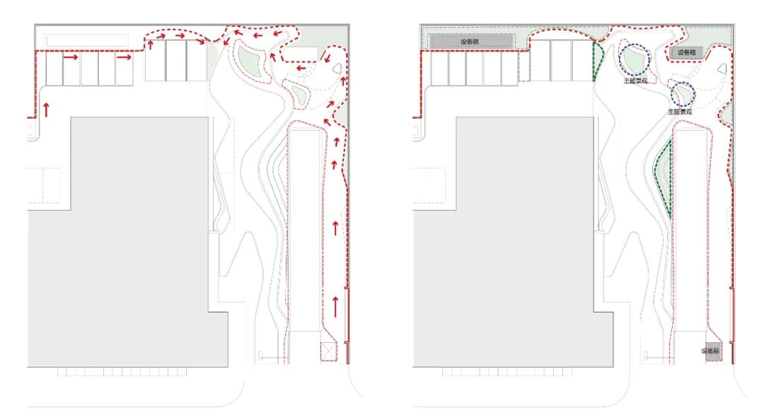
概念分析图 (左)画卷平面根据活动密集度进行摆动(右)画卷轮廓划分前后景层次©中天建中
类型学创新 | Typological Innovation
刻印有波浪图案的金属方通栅栏是北京这个城市中随处可见的围栏类型,它的标准形象已经在市民的心中形成了一种根深蒂固的印象。本次设计一个重要的任务就是要去挑战这种对类型学的传统的固化认知。即一个护栏最核心的本质并不仅仅是用于简单的空间内外进行分割,它其实可以通过设计的手段,为其赋予有更多的戏份和对空间的影响力。
Metal strip fence with a wave decorative pattern is a very common element that can be seen everywhere in the city of Beijing. Another purpose of our design is to challenge this common understanding of the typology of fence in this city. Where the idea of a fence is no longer just a linear barrier which separate inside and outside, but it can be a much more vibrant threshold that may engage with the environment and interact with pedestrian movement, event and urban space through its fluid form.
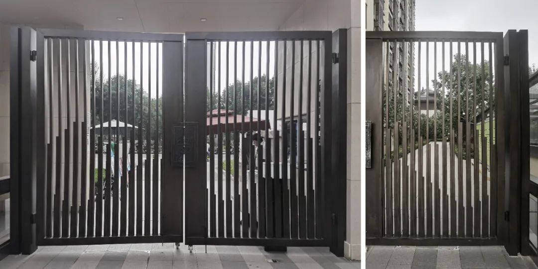
城市中常见的波浪图案护栏©张克慧

护栏的纹理变化,展现背后的绿植装饰 ©中天建中、刘敏玲
这个设计一是可以为院落带来前景和背景的层次感,将次级的景观元素以及设备箱放置在流动边界之后,和主题景观进行等级划分。其次,移动的行人能获得一种动态的视觉效果,即随着观察角度的不断转动,看见不断变化的山水图案。
With such arrangement, visual layering and hierarchy would be established, greenery and vegetation will be differentiated into ‘backdrop’ and ‘front objects’ base on their positioning on site. So as the observer move through the space, the appearance of the ‘painting scroll’ will go through constant transformation base on observer's viewing orientation.
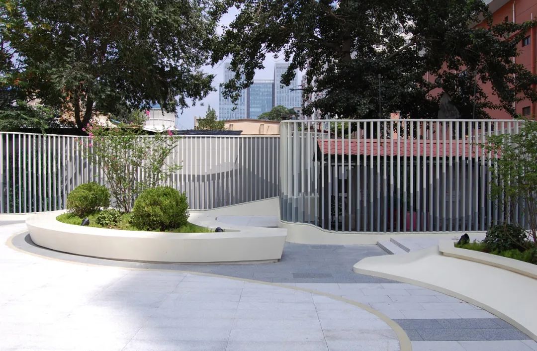
画卷形成主题花池与燃气机房的层次划分©甘力
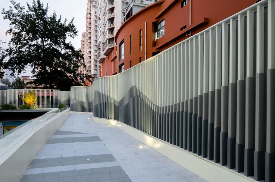
围墙形态根据不同区活动需求进行变化©刘敏玲
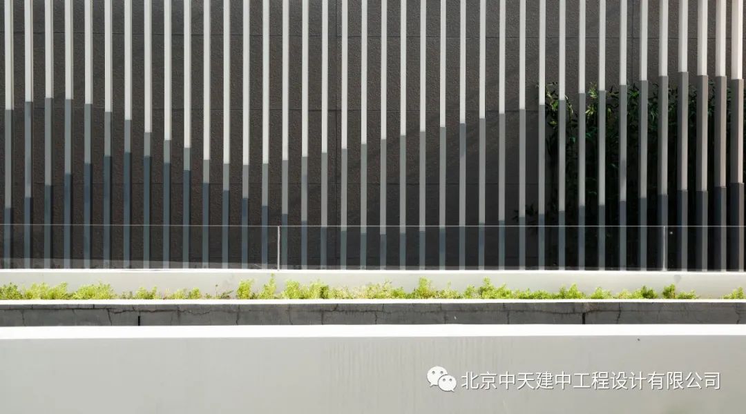
景观墙细节©刘敏玲
场所性营造 | Forming Place
环绕的方式形成车库坡道的围挡。设计采用一体化的建构语言,从白色预制混凝土逐渐变成白色铝板,到最后逐渐攀升变成包裹设备箱的穿孔铝板。
A strap of concrete ‘ribbon’ will weave across the site, and wrap around the existing ramp, hence generating a sense of movement that will disrupt the rigid order that the site originally possess.
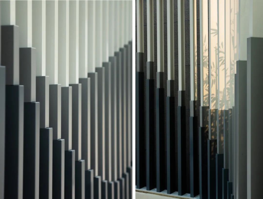
铝方通光影细节与质感©刘敏玲
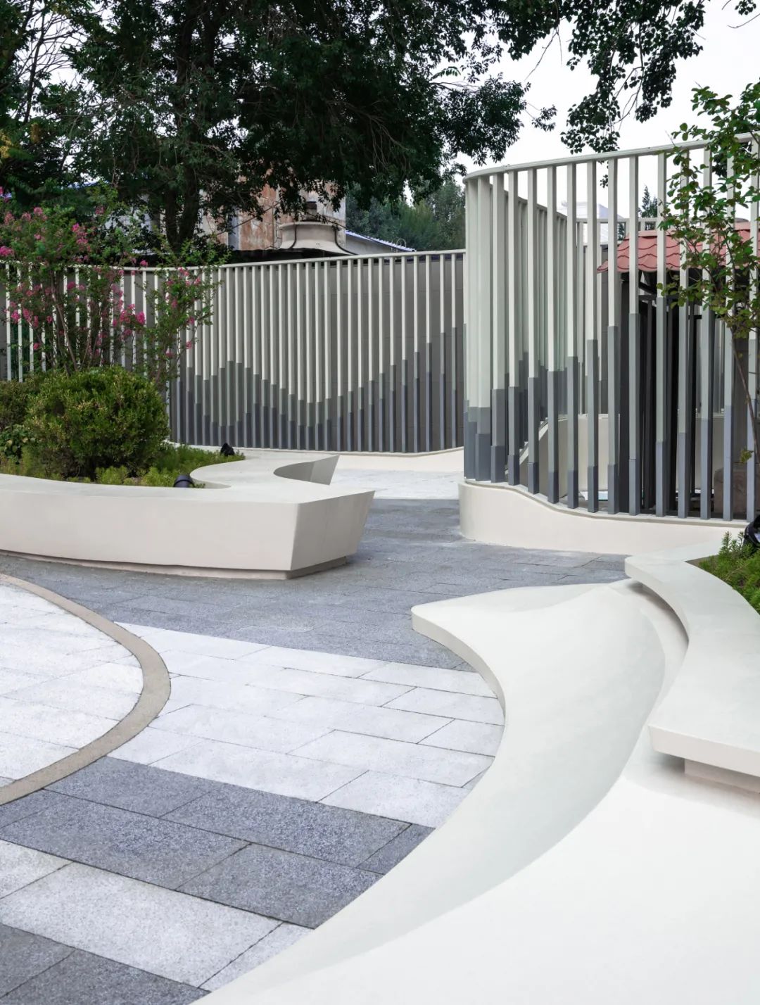
通过设计语言将不同的元素融合在统一的系统当中©刘敏玲
根据不同区域的活动需求,这道纽带会在240㎜、400㎜和900㎜三个高度之间变化。240mm为踢脚,400㎜为座椅,900㎜则是供烟灰缸嵌入的景观台面;它既可以是山水画卷墙体的基座,也可以是车库入口的围挡,还可以是包裹场地中大型排风口的装饰面 —— 设计通过一体化的曲线语言,将三种不同的物件属性融合在一个统一的建构元素当中。
Base on requirements of various events, this ribbon will vary in height, between 240㎜、400㎜and 900㎜. 240㎜ will act as footing and skirting, 400㎜ as seating and when raise to 900㎜ it will then provide volume that encloses trashcan, ashtrays and etc. The ribbon can be seen as the plinth for the ‘painting scroll’, or its form may ascend and wrap around objects so it becomes decorative cladding. Thus elements that were scattered on site will be organist and unified into one integrated system.
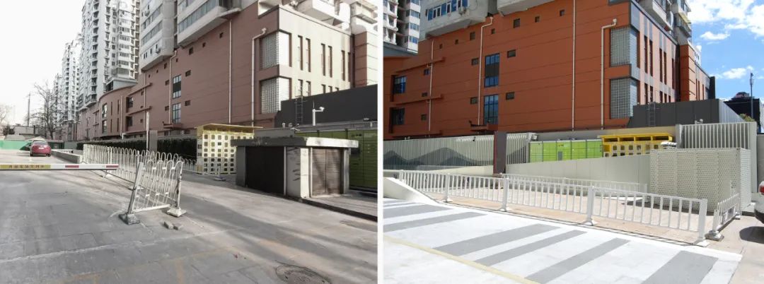
地面排风设备改造前后对比©甘力
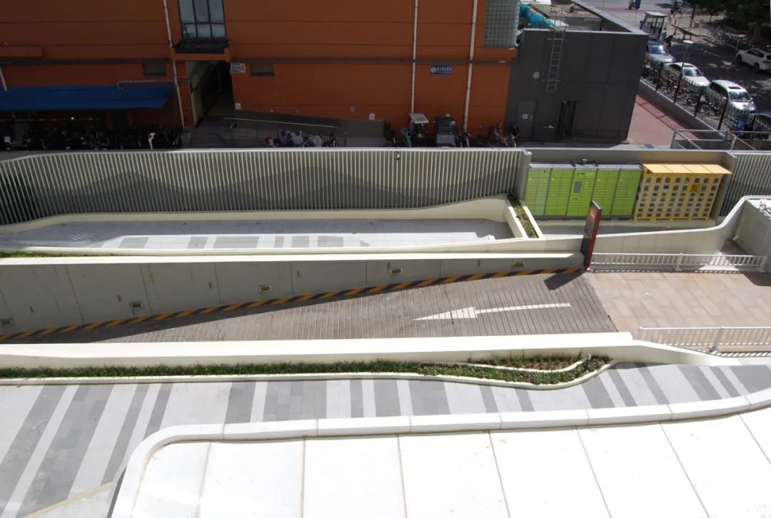
通过设计将不同的元素融合在统一的系统当中©甘力
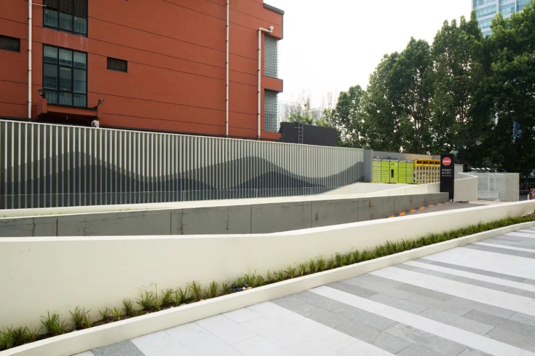
基座如白色纽带将不同的元素整合成统一的建构系统©刘敏玲
主题花池的设计则由两组定制的GRC模块拼合而成。生动的不规则轮廓形态成为视觉焦点,如同处在浪潮中的两个小岛。通过特定的规划和设计,这两座小岛的边界产生了对汽车流线的阻挡,从而在场地的东南区域形成一片仅供行人进入的互动空间。同时它的轮廓也与山水画背景墙形成呼应,自然围合出一系列“口袋式”的微型活动广场。
A set ‘islands’ situated on the southeast part of the site will form a barrier that will prevent vehicle movement but allow pedestrian to penetrate through. The shape of these two blockade are carefully designed so they would acquire outstanding visual feature, and appear as two ‘pebbles’ seating on dynamic waves. In the same time, their outline will form a series of enclosed spatial ‘pockets’ that may contain temporal habitation and events.
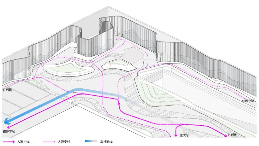
院落流线分析图©中天建中
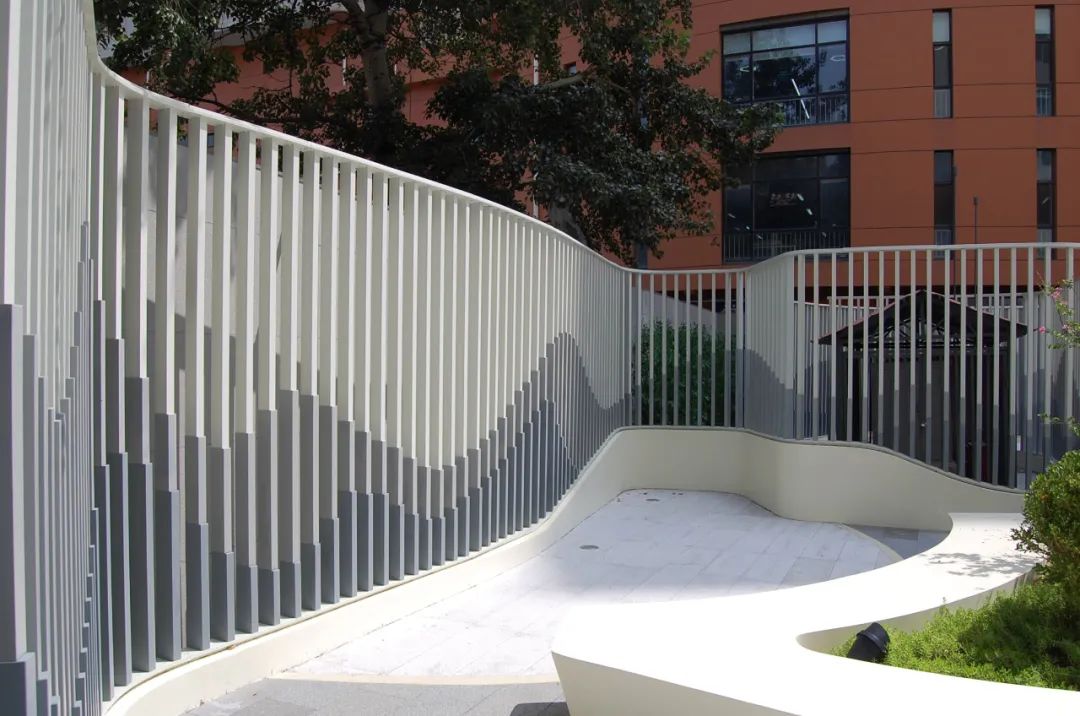
口袋式微活动空间©刘敏玲
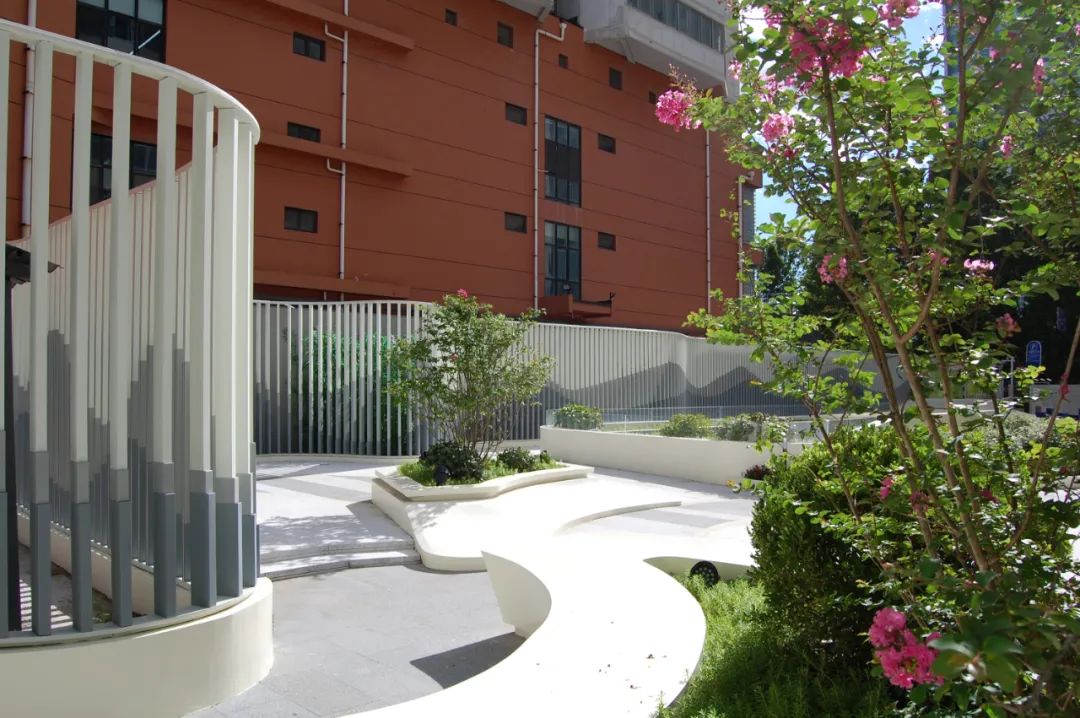
GRC花池与围栏形成的微活动空间©甘力
相关推荐

首页

项目

搜索

品牌

我的

